.png)
Project Maverick Dashboards (UI Design for Unilever FX Football Partnership)
-
UI design
Project Context
-
Project Maverick dashboard
Tools Used
-
Figma
Tool Used: Figma
Client: Unilever (Internal Use)
Project Context: Project Maverick – Centralized Measurement Dashboards
Type: Internal Business Intelligence / Partnership Tracker
Overview
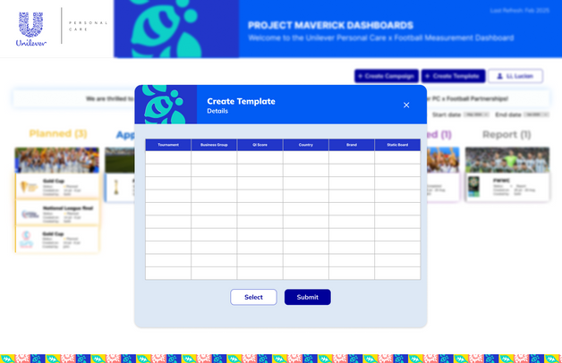
The Project Maverick Dashboards were created to support Unilever’s FX Football Partnership by offering a centralized, interactive measurement hub. These dashboards present campaign data across regions and timelines, enabling Unilever teams to track the performance, impact, and return on investment (ROI) of their partnership efforts.
🎯 Objective
To redesign a centralized dashboard system that:
-
Tracks campaign activities and statuses (Planned, Approved, Active, Completed)
-
Measures key metrics: Media Value, Financial ROI, Store Activations, Coverage
-
Highlights partnership progress for FWWC (FIFA Women’s World Cup)
-
Allows Unilever to evaluate real-time impact in one unified place
𓂃🖊 Redesign Goals
To guide the redesign, let’s aim for:
-
Hierarchy & Focus - Emphasize what's important: KPIs & campaign status
-
Scan ability - Users should get insights in under 10 seconds
-
Consistency - Use modular cards, fixed filters, aligned grids
-
Responsiveness - Mobile-friendly layout
-
Brand Alignment - Reflect Unilever’s brand palette and tone (clean, confident, corporate)
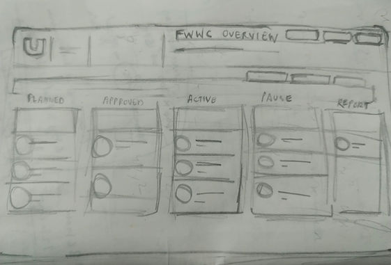
Image references given
Kanban style board


Sketches

Design